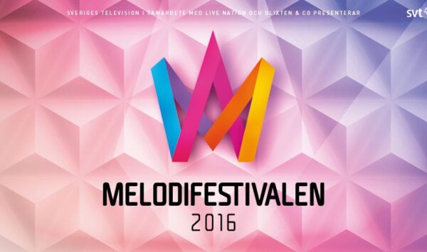
While the ticket sale for Melodifestivalen 2016 will kick off on Thursday, Melodifestivalen’s ticketing partner ticnet.se has revealed the contest’s new logo. It is the second time the logo has been changed since the new system and branding was launched in 2002.
Back in 2002, Melodifestivalen was introduced with the well-known crown that was also featured before every song and in every title. This version was in use until 2010.

In 2011, the logo was revamped and got a curvy look. It was in use up to this year’s Melodifestivalen.

Starting from 2016 the new logo still will still consist of the crown, which is a national emblem of Sweden, and the five colors – light blue, purple, pink, orange and yellow. However the design is totally different and also shows different letters such as M, A and V. The font for the title and the year has also been changed:

Do you like the new logo? We will probably see a total re-branding of the Melodifestivalen related websites and items soon.


