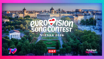
The European Broadcasting Union (EBU) has unveiled the new Eurovision Song Contest logo coinciding with the forthcoming 70th anniversary of our beloved contest.
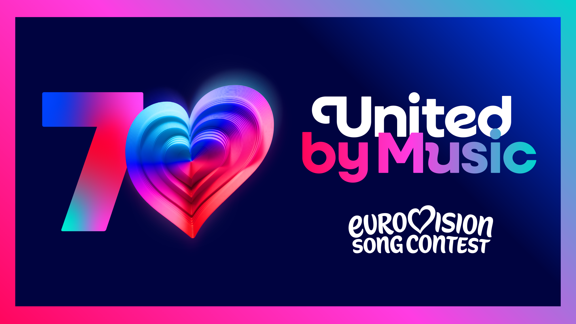
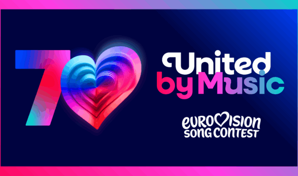
Yes, it’s true the Eurovision Song Contest logo has been refreshed with a brand new fresh look! Next year sees the 70th Eurovision Song Contest, our beloved contest will be celebrating 70 glorious years of music, glitz, glam and glitter.
The very heart that beats at the Eurovision Song Contest which was launched in 2004 and restyled in 2014 has been given a further refresh. The Eurovision Song Contest’s new look and refresh is innovative, modern, colourful and clean!
The new branding and look has been created by the EBU in collaboration with British branding company PALS, the very same company who was resposible for the Liverpool ESC 2023 brand strategy.
A custom made Singing Sans typeface has been introduced, we will see it implemented on the Eurovision Song Contest’s digital platforms and beyond.
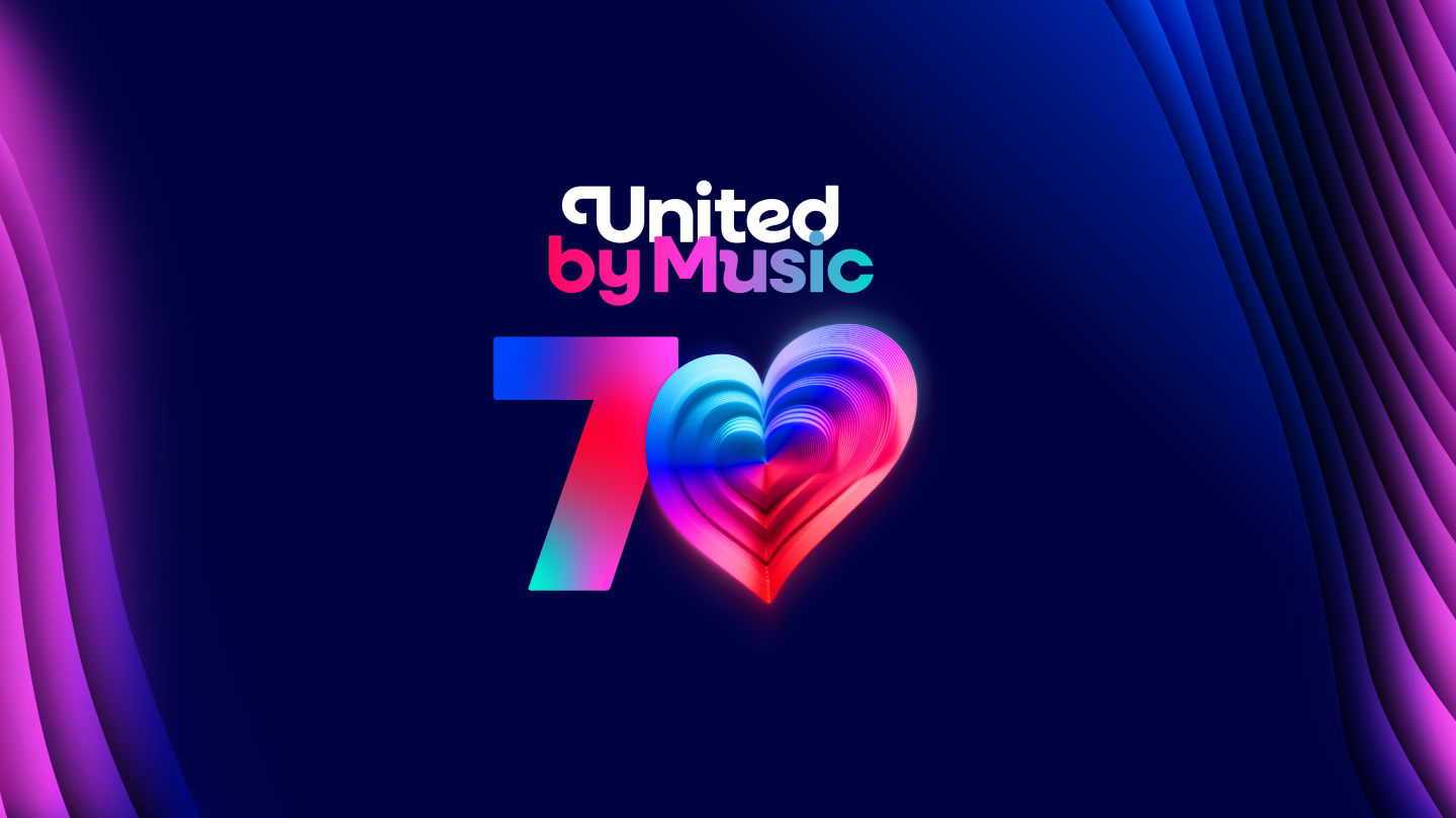
The new logo and the chamaleon heart will gain more momentum when seen in 3D. Notably the heart for the 70th Eurovision Song Contest in Austria incorporates 70 layers celebrating the 70 glorious years of the ESC.
The EBU’s press release reads:
From today, fans will see the Eurovision Song Contest is wearing a new look. The Eurovision Song Contest is celebrating seven decades of being United by Music in 2026 and marking the event in true Eurovision style: with sparkling new logos, fonts and a colourful new brand identity.
From logo to lettering, the new look is playful and elegant – from the smooth new cursive ‘E’ in the Eurovision Song Contest logo to the custom-made “Singing Sans” typeface which will be used across our digital platforms and beyond.
The main logo has been refreshed to simplify the iconic hand-drawn script, launched in 2004 and refined in 2014, into a single, unique marque – with one thing at its centre: the unmistakable Eurovision Song Contest heart which is beating louder than ever.
The EBU’s press release continues to read:
The beating heart of Eurovision Paired with the new logo is a new graphic asset – the “Chameleon Heart” – the Eurovision Song Contest’s emotional compass – absorbing cultural influences, music, and movement. It adapts to reflect the host nation’s identity, a performer’s individuality, or a particular theme — while remaining unmistakably Eurovision.
70 years in 70 layers
This versatility can be seen in a special logo 3D heart, which will be visible everywhere in the build up to the 70th edition of the world’s largest live music event in Austria next year. The 70th heart incorporates 70 layers – one for every fabulous year of the Eurovision Song Contest.
The Eurovision Song Contest’s brand refresh has been created by the EuropeanBroadcasting Union (EBU) in collaboration with British branding studio PALS who also worked on the brand strategy for Liverpool 2023.
Martin Green CBE (Director of the Eurovision Song Contest/ EBU) says:
The Eurovision Song Contest has always been about evolution – musical, cultural, and creative. This refresh honours 70 amazing years while taking the brand forward to an exciting future. It’s bold, playful, and full of heart – just like the Contest itself. We’re so proud to unveil it to the world.
Our new logo and look have been designed to make the Eurovision Song Contest brand clearer on digital platforms, bring our family of projects all into one space, and protect the brand globally for EBU Members as the Contest continues to attract new audiences across the world.
You’ll start to see more of our new brand identity as we head towards next year’s Eurovision Song Contest and there’ll be more surprises, and details on all the activities celebrating 70 years of being United by Music, coming in the months ahead.